An Accessible Web Is a Web for Everyone
By building accessibility into design from the start, we create smoother, more inclusive, and more sustainable digital experiences.

We don’t need to tell you that digital technology is now a core part of everyday life. Accessing information, filling out a form, booking a train ticket… today, almost everything happens online. But for millions of people, this digital world is still full of barriers. Accessibility isn’t a “nice-to-have” — it’s a right. And a shared responsibility.
At Atipik, we believe no one should be left behind by technology. Here’s what you need to know about building accessible digital interfaces — and why it truly matters.
Why Accessibility Matters
The internet is meant to connect everyone. Yet many people are still left out. Unreadable websites, poorly designed interfaces — for many users, navigating online is a daily challenge.
In Switzerland, more than 1.7 million people live with a disability, with varying impacts on their daily lives (FSO, 2022). And no, accessibility isn’t only about permanent disabilities. A broken arm, a migraine, a noisy environment, or a slow internet connection can all make accessing the web harder.
Accessibility means designing for every situation — and for everyone.
WCAG: The Global Standard for Digital Accessibility
In December 2024, the W3C (World Wide Web Consortium) released version 2.2 of the WCAG (Web Content Accessibility Guidelines). This international standard outlines best practices for making websites, applications, and interfaces accessible — whether on desktop, mobile, or in public spaces like kiosks and ticket machines.
WCAG is based on four key principles:
- Perceivable, content must be perceivable by all users.
For example, using color alone to show a selected menu isn’t enough — you should also add an underline or an icon. - Operable, interfaces must be usable without limitations.
For instance, navigation, interactions, and inputs must all be accessible via keyboard without any roadblocks. - Understandable, information must be clear, and interfaces should function in a logical, predictable way.
For example, form errors should display clear and helpful messages. - Robust, content must remain accessible and functional across current and future technologies, no matter the platform.
For instance, interfaces should work seamlessly across desktops, mobile devices, and screen readers.
The Three Levels of Conformance
A conformance level refers to a set of criteria that must be met to make a website or app accessible. The higher the level, the more numerous and stricter the requirements. Keep in mind, though, that even meeting all three levels doesn't guarantee full accessibility for every disability scenario. For example, to achieve Level AAA, you must first meet all the design, technical, and content criteria of Levels A and AA.
- Level A : The bare minimum. If a site doesn’t meet even this level, it clearly excludes part of its audience.
For instance, to meet Level A, you must provide subtitles for informative videos.
The standard practice is to create an .srt subtitle file and avoid auto-generated or hardcoded subtitles embedded directly into the video file. - Level AA : WCAG Level AA is widely recognized as the most commonly adopted accessibility standard worldwide. It includes all the criteria from both Levels A and AA, ensuring a higher level of accessibility for most users.
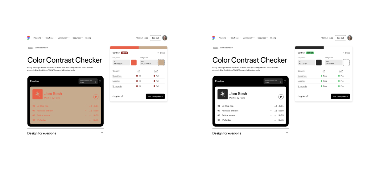
To meet Level AA, for example, you must ensure proper color contrast (with exceptions for logos).- Normal text:
➤ Minimum contrast ratio of 4.5:1 between text and background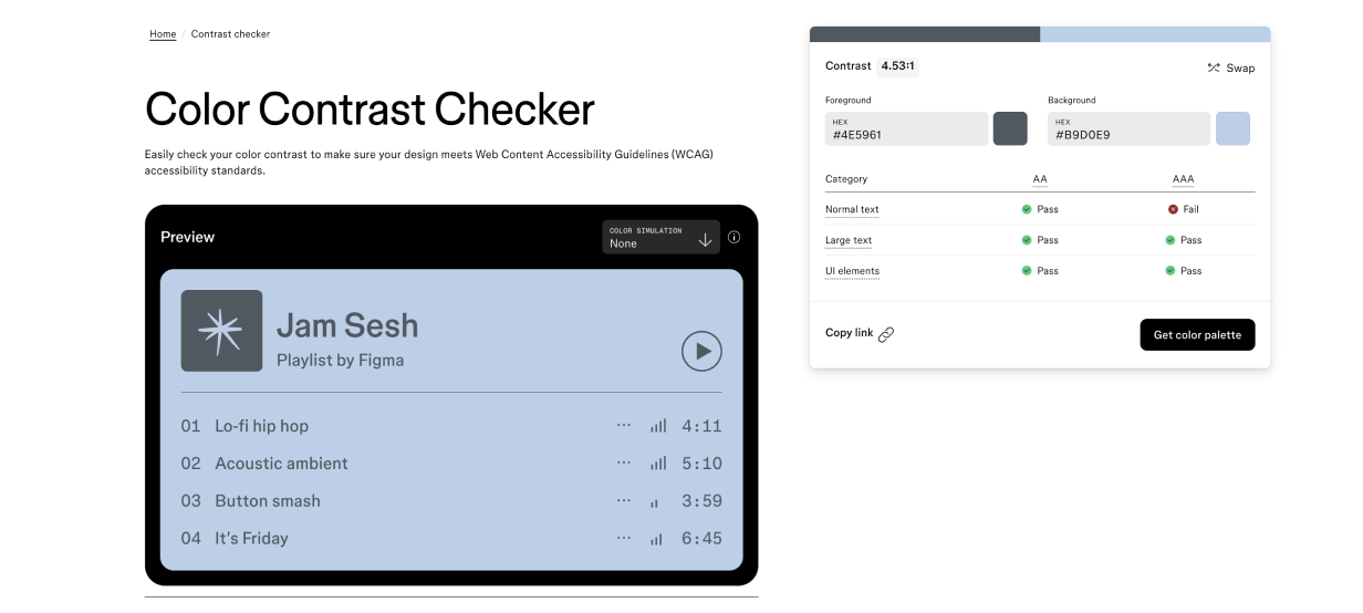
- Large text (≥ 18pt or 14pt bold):
➤ Minimum contrast ratio of 3:1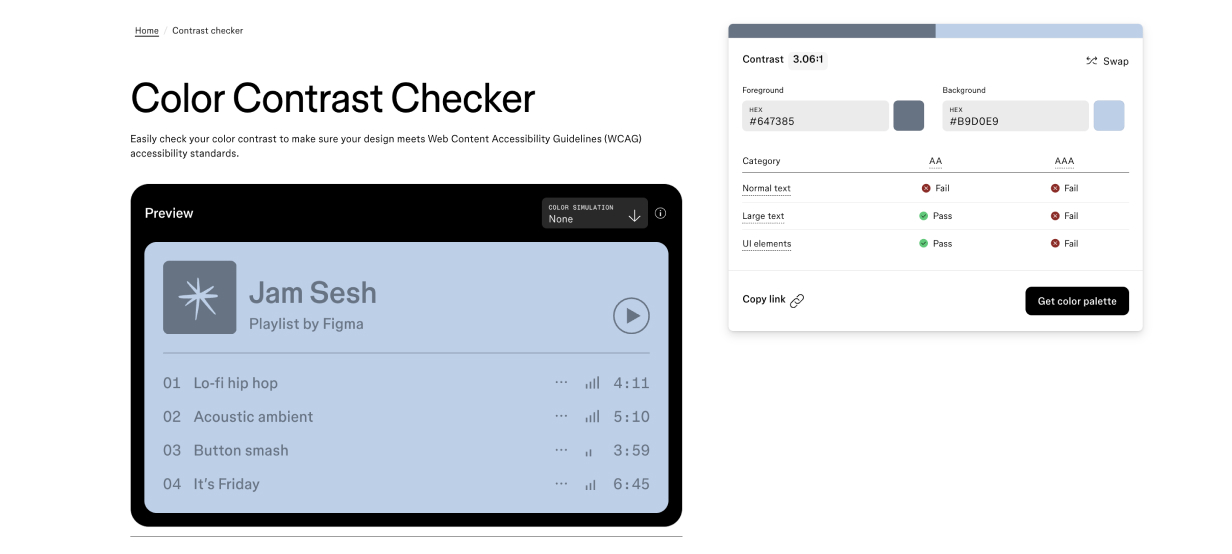
- Normal text:
- Level AAA This is the most demanding level. It's ideal, but difficult to achieve across all types of content — which is why it’s not mandatory.
For this level, you must meet stricter color contrast requirements than those in Level AA (again, with exceptions for logos).- Normal text:
➤ Minimum contrast ratio of 7:1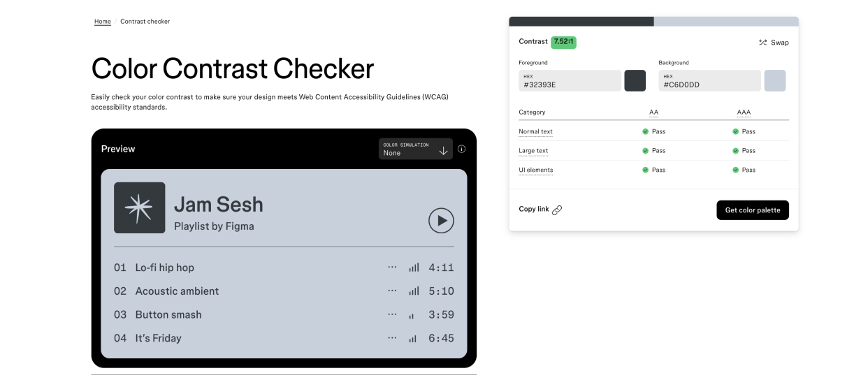
- Large text (≥ 18pt or 14pt bold):
➤ Minimum contrast ratio of 4.5:1
- Normal text:
In Switzerland: The eCH-0059 Standard
Since 2020, the eCH-0059 standard has defined digital accessibility requirements for public services and concessionary companies. It is based on WCAG 2.2 (Level AA) and goes further by aligning with European Union practices:
- Recommends using the PDF/UA format for truly accessible documents
- Translates key content into sign language and simplified language
- Requires publication of an accessibility statement
- Includes a feedback form to report any accessibility barriers
This standard aims to create an inclusive web where access to information and services is guaranteed for everyone — no exceptions.
Three Simple and Practical Accessibility Tips
You don’t need to be an accessibility expert to take your first steps. Here are some easy checks to help you evaluate whether your site or prototype meets basic accessibility requirements.
1. Check Color Contrast
Strong contrast is essential for readability — especially for users with visual impairments or visual fatigue.
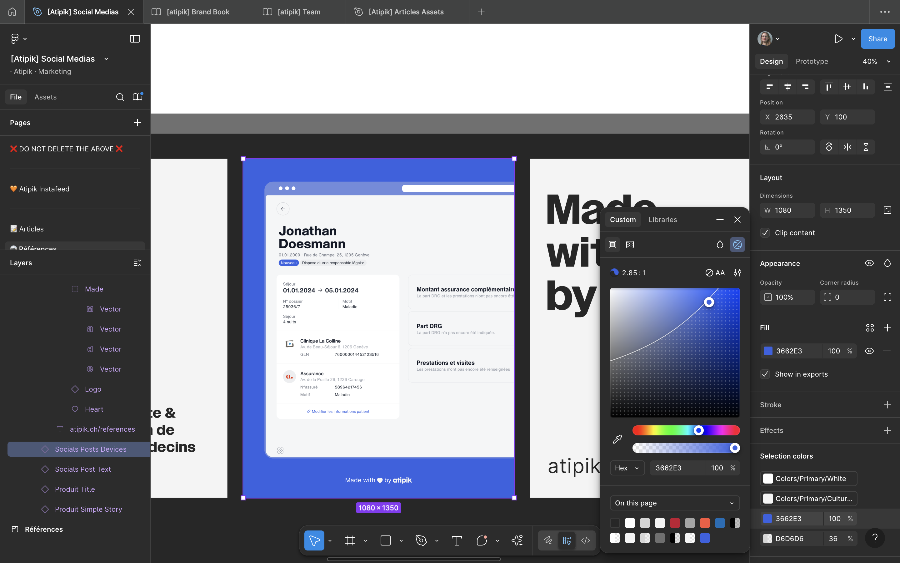
How to do it? With the Figma Color Contrast Checker, just enter your background and text colors. Once added, you can verify whether the contrast meets AA or AAA standards.
Working with Figma? There's also a component that shows you contrast levels directly in your designs. Handy, fast, and essential.
2. Check Keyboard Navigation
Tabbing allows users to navigate without a mouse. It's essential for people who use screen readers or who don't use a mouse in a conventional way.
How to do it? On desktop, press Tab to move forward and Shift + Tab to move backward between interactive elements (links, buttons, menus, etc.).
What to look for:
- All elements should be accessible via keyboard
- The navigation order should be logical and smooth
- There should be no blockages (menus are often overlooked...)
Tip: if tab navigation is messy, screen reader navigation will be too.
3. Write Effective Alternative Text (Alt Text)
Any image that conveys information (and isn’t just decorative) must have a text alternative. This is what a screen reader reads to describe the image to the user.
Where to add it?
→ In the HTML code (alt="..."), or directly in your CMS or visual editor.
Keep in mind:
- Be precise, but don’t overdo it
- Describe the purpose or meaning of the image, not just what it shows
Two Real-World Examples
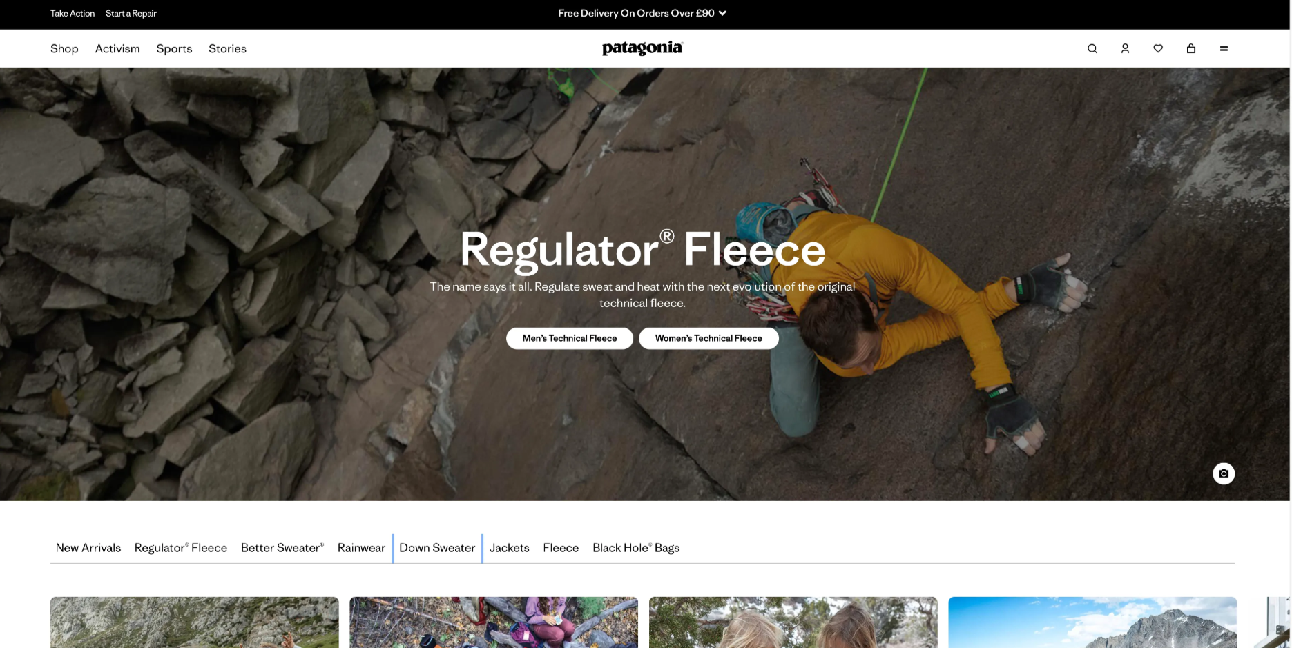
Patagonia
What works well:
- Smooth keyboard navigation
- Modal windows are well managed (focus returns to the trigger element after closing)
What could be improved:
- Background banners can’t be paused (they move automatically)
- No alt text provided for visuals
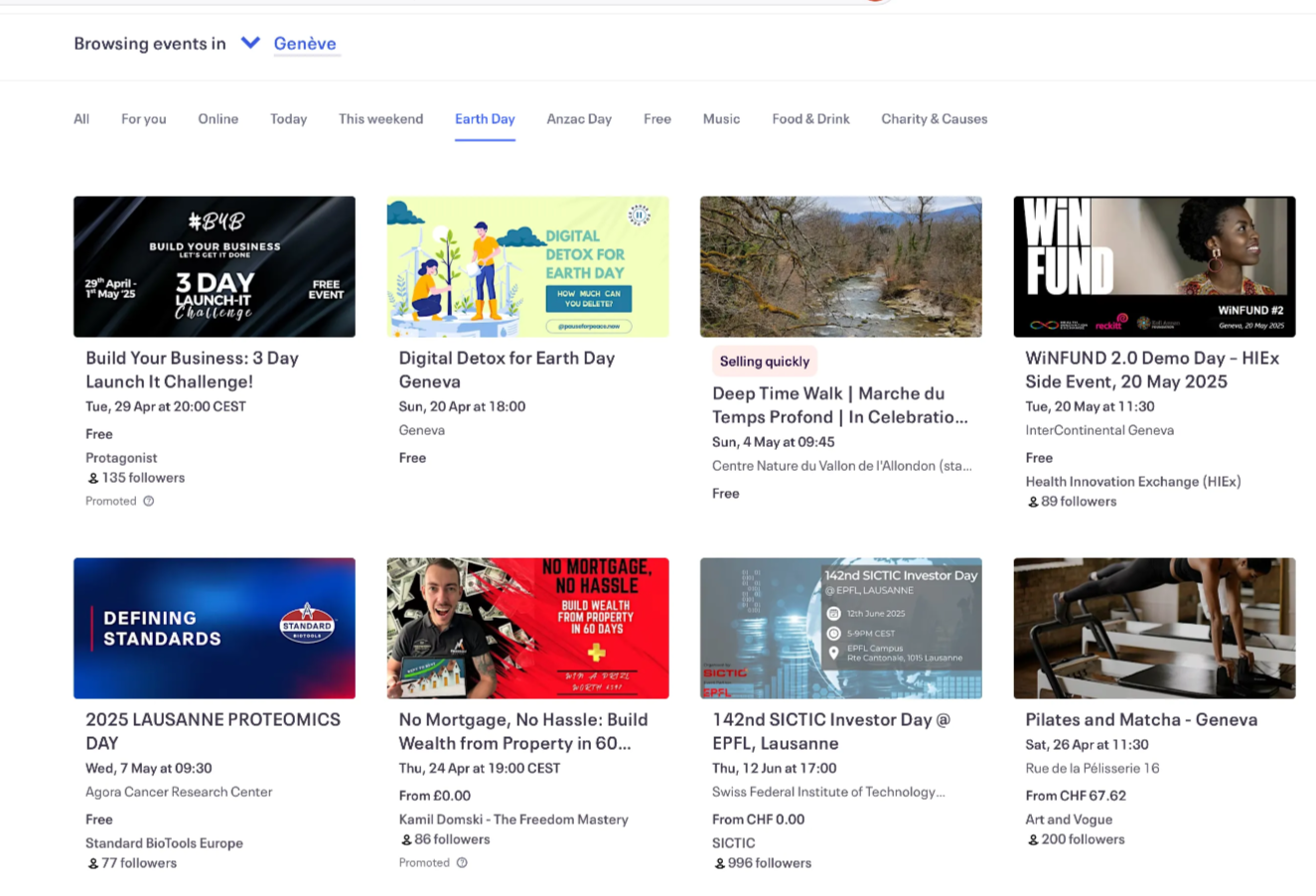
Eventbrite
What works well:
- Full keyboard navigation
- Alternative text is provided for icons
- Strong, compliant color contrasts
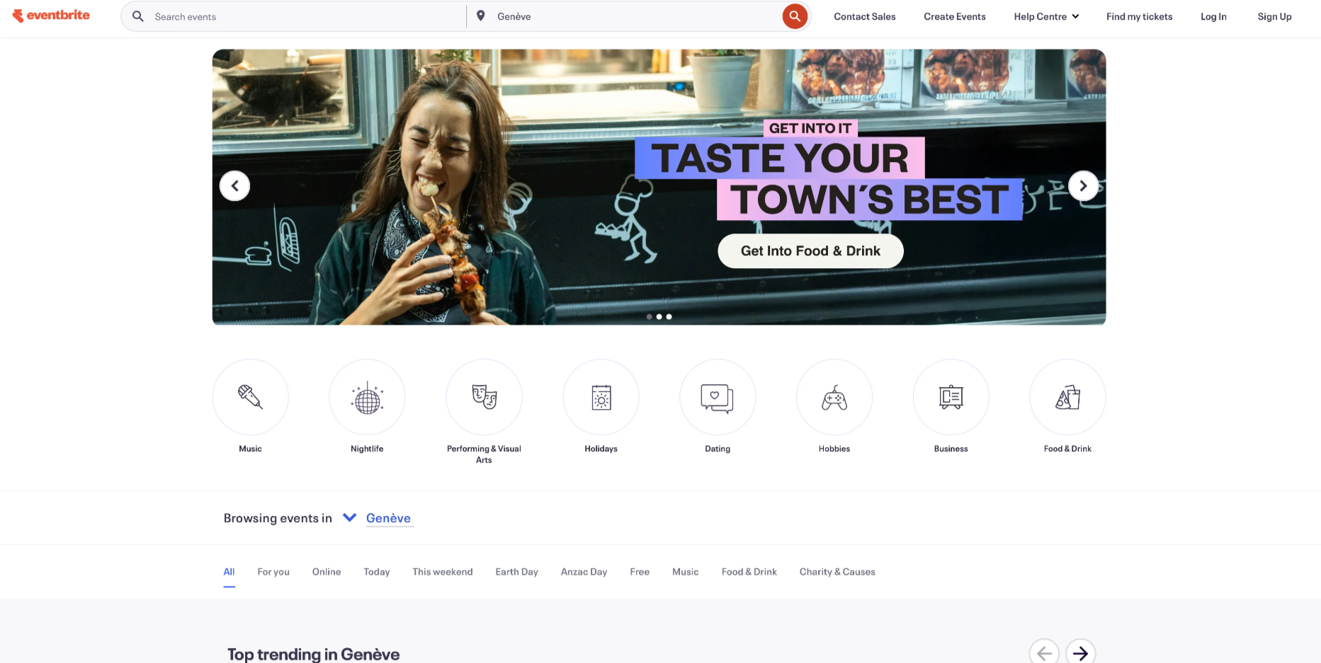
What could be improved:
- Homepage banners cannot be paused
- An interactive tab ("tabpanel") is difficult to access without navigating through all other elements first
In Summary: Designing for Everyone Means Designing Better
Accessibility isn’t just a technical checklist. It’s a mindset rooted in common sense, inclusion, and respect. By integrating these best practices from the very beginning, we don’t just meet a standard — we make the web more equitable, more comfortable, and more sustainable for projects that go far beyond public or governmental scope.
And most importantly, we create experiences that truly matter — for everyone.
Yasmine
Products & Projects manager