Dark patterns, the dark side of UX
In the digital age, who has never been blocked or frustrated on a website or mobile app by doing something against their will? Find out how to identify dark patterns, the obscure universe of intentionally rigged interfaces.
Nearly 67% of the world's population (5.3 billion) owns a smartphone, including about 87% in Europe, and nearly 63% (4.9 billion) have access to the Internet. Each of these individuals is confronted daily with web and mobile interfaces. Some companies, which have had to become digital over the years due to the evolution of new technologies, sometimes provide a deceptively designed interface to entice you to perform unwanted actions in order to increase their profit or visibility. These actions you do not wish to perform are called dark patterns.
What is a dark pattern or dark UX?
The dark pattern or dark UX is an interface that is deliberately rigged with cognitive biases to trick you into doing things you don't want to do or to make you stay on a service for a long time. In 2010, the London-based UX designer Harry Brignull came up with the following expression:
Deceptive design patterns (also known as "dark patterns") are tricks used in websites and apps that make you do things that you didn't mean to, like buying or signing up for something. Harry Brignull
Cognitive biases
Companies that use dark patterns are very familiar with cognitive science and neuroscience to influence you to make unconscious actions. To do so, they use cognitive biases which are thought mechanisms that push your brain to influence your behavior to create a habit in order to provoke the addiction to a service.
- Trigger or Leverage: there are two kinds of triggers: internal and external. The first one is an emotion and a feeling sometimes unconscious, like for example boredom. The second is the context and the environment. These are the two triggers that will push you to act.
- Action: the trigger will then lead you to take an action. For example, the triggers "boredom" (internal) and "notification" (external), will lead to an action "open an app".
- Reward: after performing the action, you will be phished by the company to give you a reward in order to influence you or seduce you to buy a new product for example.
- Investment: to make you come back to the product and to keep you loyal, some companies propose to their users to do small actions in order to receive even more rewards.
Thus, you will execute this loop in an unconscious way and constantly come back to the website or the mobile app in order to make you addicted without you realizing it.
The 12 types of dark patterns
We identify 12 types of dark patterns that aim to lure or solicit you to buy a product or a service. The dark patterns are used to collect your personal data, increase the traffic of a website or your shopping cart, subscribe to offers you don't want.
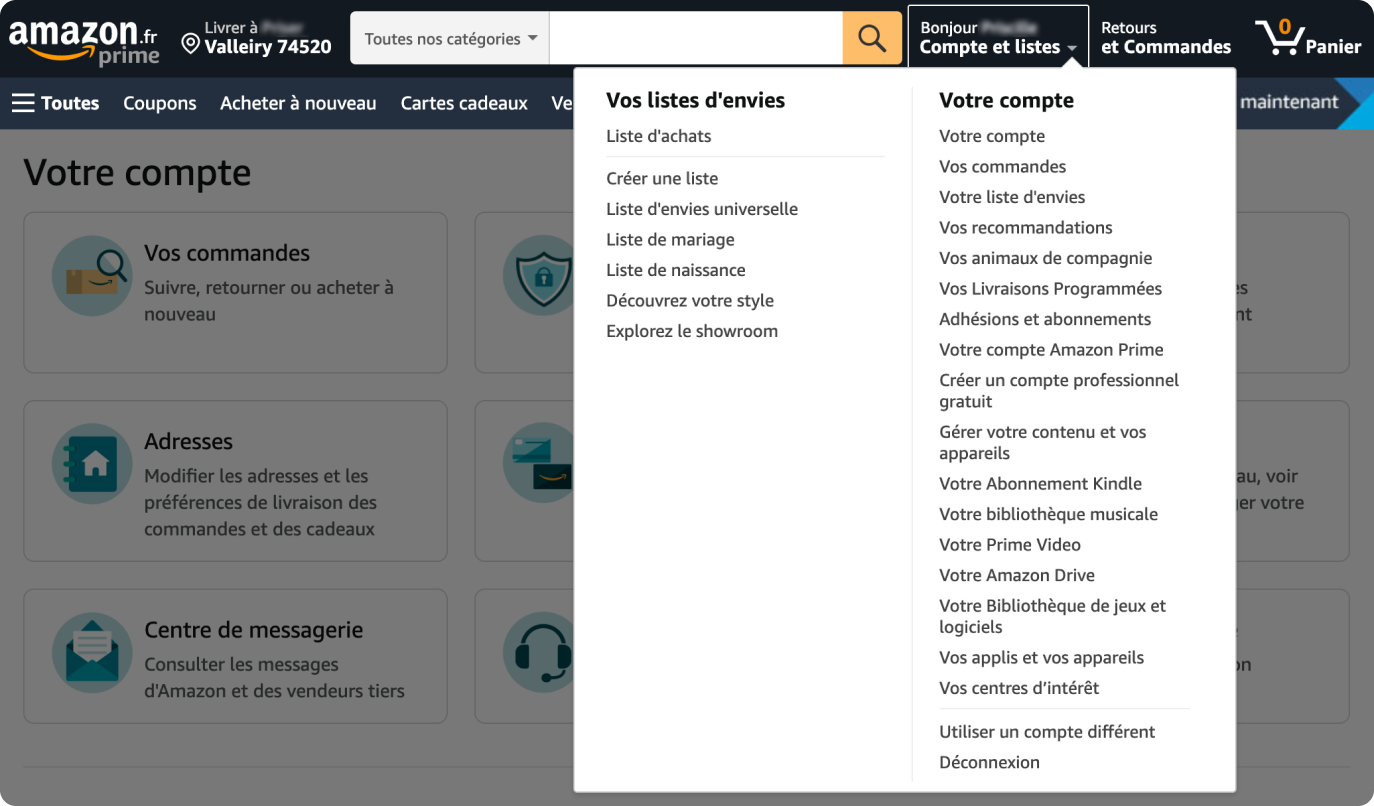
#1 Roach motel (Complicate the path)
This dark pattern makes it difficult for you to perform an action that would be counterproductive to the company's profit in order to keep you on its website or service. In the example below, it is difficult to delete your Amazon account because the action is hidden.
#2 Bait and switch
This dark pattern makes you take an action that will generate another action that was not desired form you. Example: promotional pop-up that prompts you to log in or register before accessing the desired products.
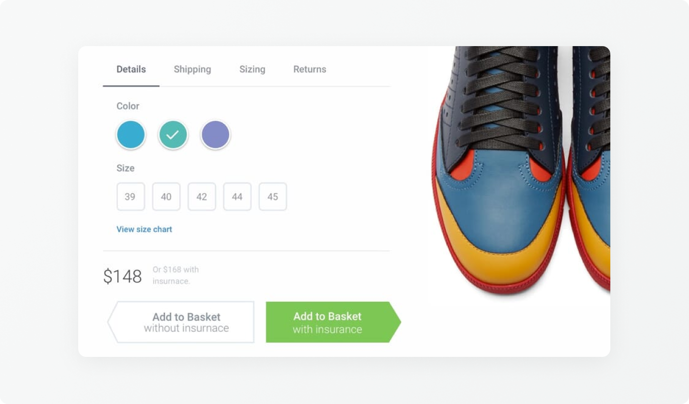
#3 Trick questions
This dark pattern causes you to give rash answers on a form or to take a confusing action. Below, the purchase button is confusing because it gives you two options: without insurance or with insurance. The latter is highlighted to mislead you into buying an additional service with your product.
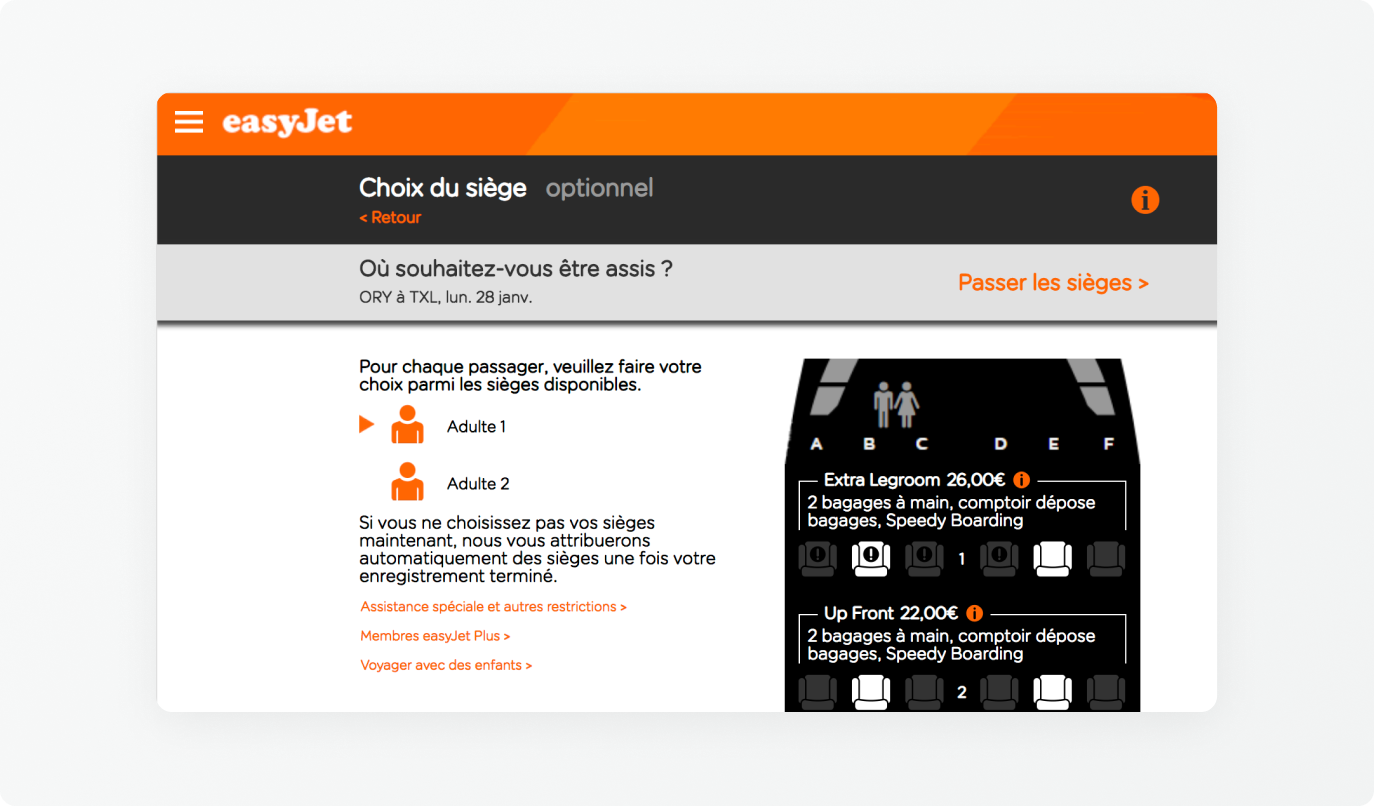
#4 Sneak into basket
This dark pattern allows you to automatically add other items to your shopping cart that you don't want. Example: when booking a flight, the company can add an additional insurance or service.
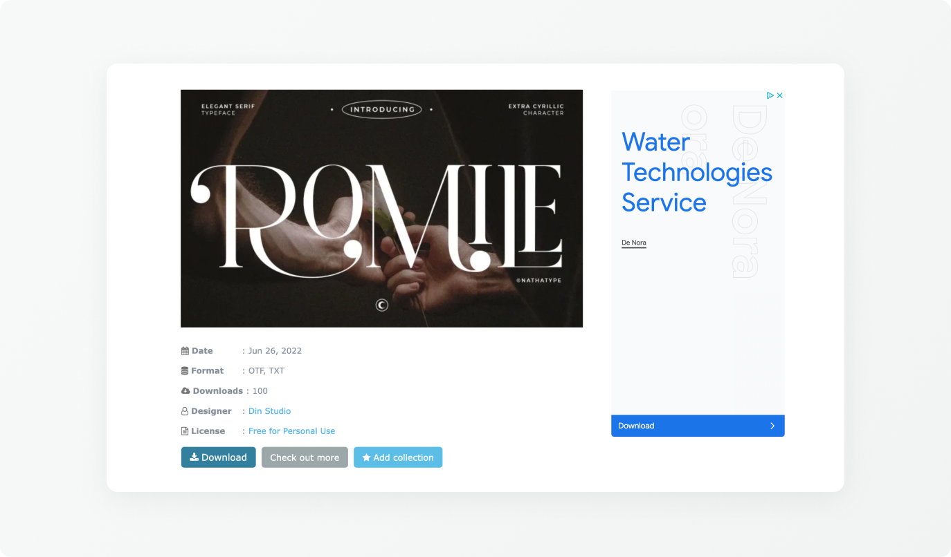
#5 Disguised ads
This dark pattern aims to deceive you by integrating advertisements in a website with the same graphic look as the website, in order to push you to click on the advertisement. Example: On websites where you can download movies or free resources, there are often several "Download" buttons. One will do the desired action and the others will open external websites.
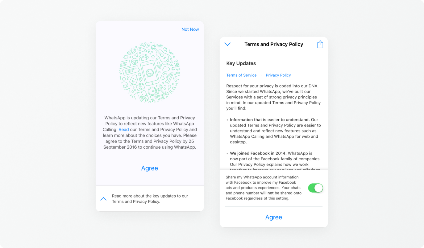
#6 Privacy zuckering
This dark pattern encourages you to make your personal information public in order to share it with third-party companies. The Electronic Frontier Foundation (EFF) came up with this term in reference to Facebook CEO Mark Zuckerberg. Example: in the WhatsApp "Terms and Conditions", you have an option to share your information with Facebook.
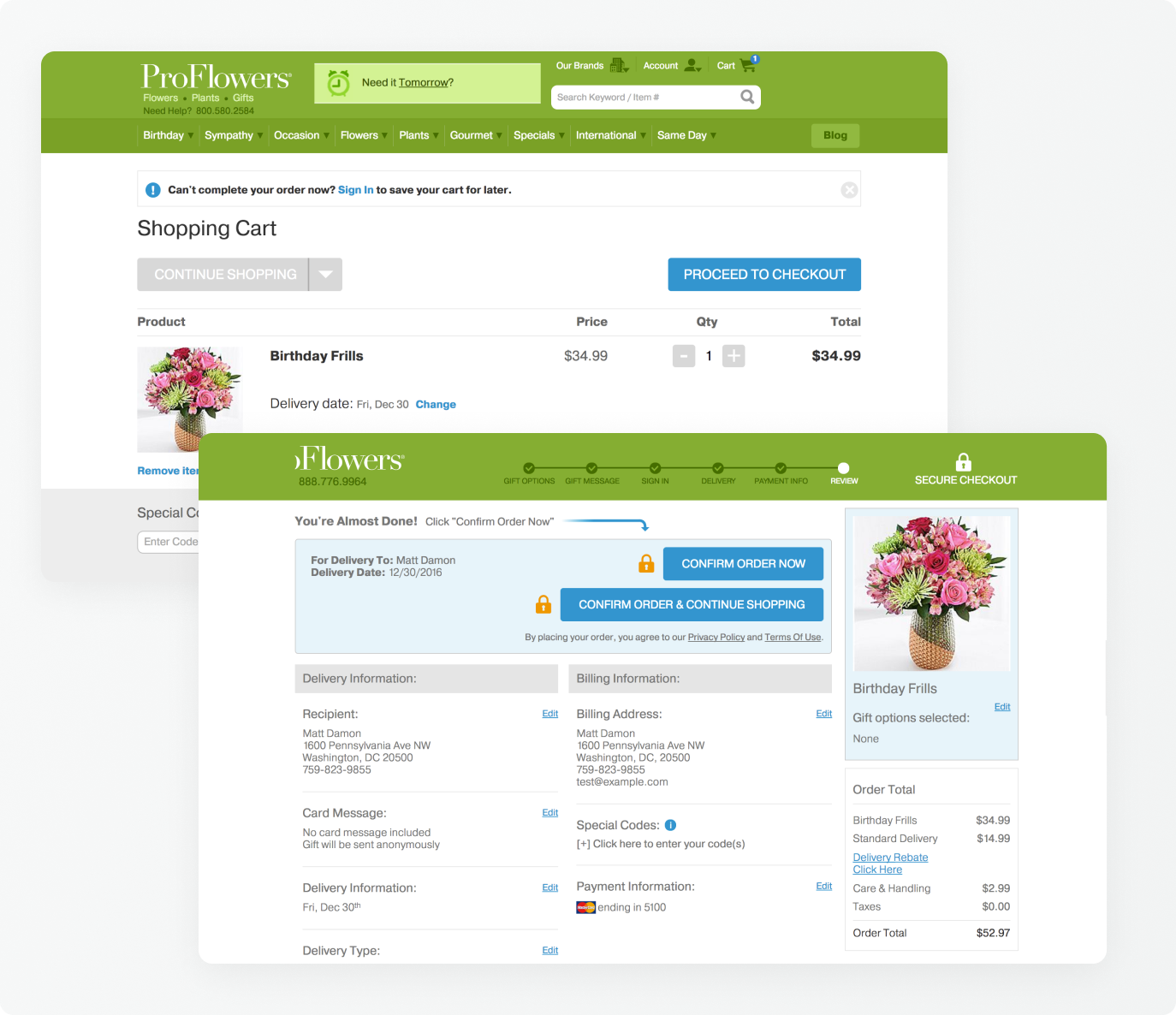
#7 Hidden costs
This dark pattern deceives you about the hidden costs (taxes, additional fees) when buying on an e-commerce website. It is when you get to the last page of the purchase process that you discover additional costs that were not specified before. In the example below, you think you're going to pay $35 for your product, but when you get to the last step of the purchase process, at the confirmation screen, you see that costs have been added.
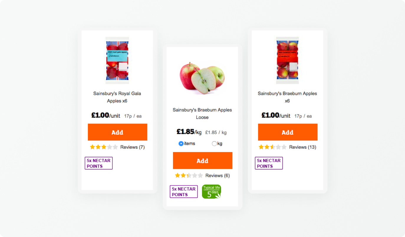
#8 Price comparison prevention
This dark pattern makes price comparison difficult by hiding competitive prices to push you into buying. Example: online wholesale stores that hide the unit price to make it difficult to compare.
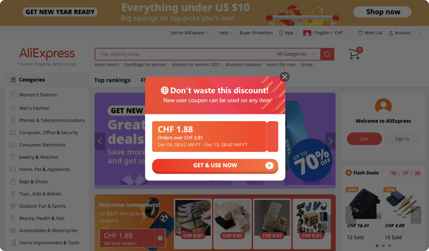
#9 Misdirection
This dark pattern aims to divert your attention from one content to another. Example: pop-up ads.
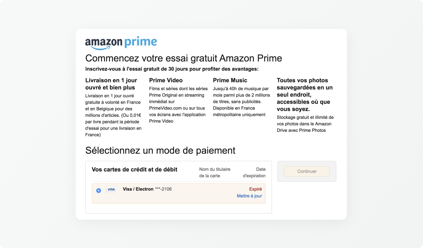
#10 Forced continuity
This dark pattern forces you to take an action to continue your journey, such as entering your credit card information when activating the free trial period of a subscription. At the end of the trial period, the subscription automatically becomes paid. Example: Amazon Prime subscription.
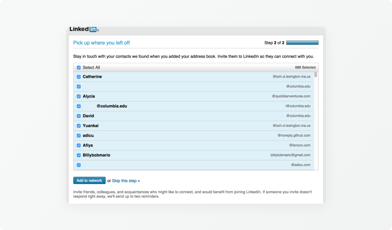
#11 Friend spam
This dark pattern asks you to access your contacts (email or social networks) under the pretext of looking for friends in order to give more visibility to the company. Example: in 2015, LinkedIn allowed, thanks to a single button, to send an invitation to all your contacts.
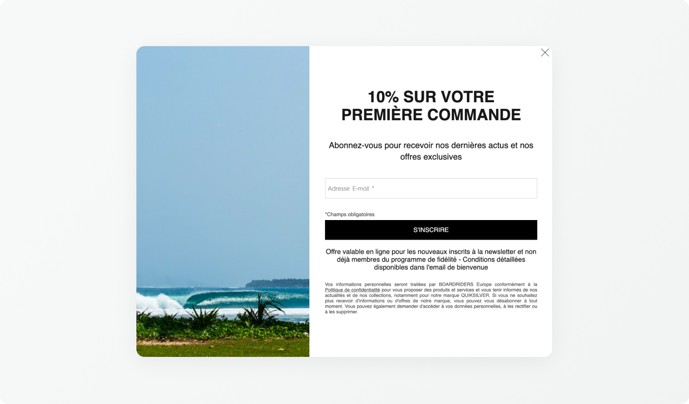
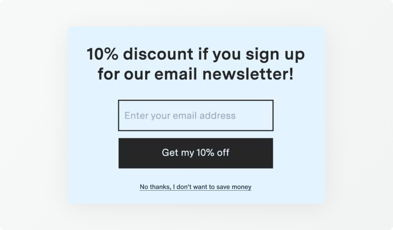
#12 Confirmshaming
This dark pattern deliberately triggers a feeling of guilt if you don't accept the service. Example: signing up for a newsletter that comes with a 10% discount, but the button to decline the signup would be turned this way: "No thanks, I don't want to save money".
UX designer Harry Brignull compiles more examples of dark patterns on his Deceptive Design Twitter account.
What about ethics?
The design of a product or a service is made to guide the users to make them do the wanted actions to reach the objectives. However, there are many abuses and some companies do not hesitate to use dark patterns for their profit before caring about their users or customers.
There are more and more voices denouncing the drifts of a deceptive and rigged design as opposed to an ethical design based on an honest and respectful user experience in order to be able to freely choose the actions we want to take.
Differences between ethical design and dark ux (design pattern)
| Dark UX | Ethic Design |
|---|---|
|
|
|
|
|
|
|
|
|
|
| |
|
So, how do you avoid being trapped by dark patterns?
When you browse a web interface on mobile or desktop, it is important to be careful not to do something you don't want to do. Here are some tips to keep in mind:
- Pay attention to the usability of each website. Sometimes, the "cancel" and "validate" buttons are reversed, so that you end up clicking on the wrong one.
- Look carefully at the checkboxes.
- Do not click too quickly on a button or a link to avoid clicking on an ad by mistake.
- Do not hesitate to go back.
- Alert your friends and family, especially those who are new to the Internet and who are more likely to fall into these well-tried traps.
The UI and UX design is an integral part of the design of a product or service. Its role is to ensure its proper functioning as well as aesthetic to give full satisfaction to users. We have seen that some companies with obscure practices encourage you to perform actions that go against your will, the dark patterns, with the sole purpose of increasing their profit to the detriment of your real needs.
Fortunately, more and more voices are being raised to denounce these dishonest practices. We are convinced that the new generation will be much more sensitive to these issues, and that the image of companies that abuse them will be greatly damaged.
Priscille
UX/I Designer