The recipe for the Perfect Button
You can find them of all kinds, not necessarily exclusive to the digital world, but anyone who has used a computer knows this component: the button.
Buttons are used to navigate, operate or control the simplest and most complex interfaces. They are also measurable for companies that rely on clicks and tracking of their users. This component is one of the pillars of human-computer interaction in user experience design! It has to be... perfect. Here is our step-by-step recipe.
The ingredients for a successful button design
Our Perfect Button will communicate a clear action in a context well defined by the rest of the interface, leaving little room for interpretation.
Text
Since text is the main element, it should be clear and simple. Start with an action verb and then with the functionality concerned, all this using a common language, understood by anyone. This good practice allows the user to predict the next step.
Sometimes the use of pronouns can be dictated by the tone of a design system. If this is the case, I strongly recommend using the subjective pronouns "I", "my", "me"... In the following comparison: "Account" and "My account", the user will identify himself more quickly by the second choice than the first.
Icon
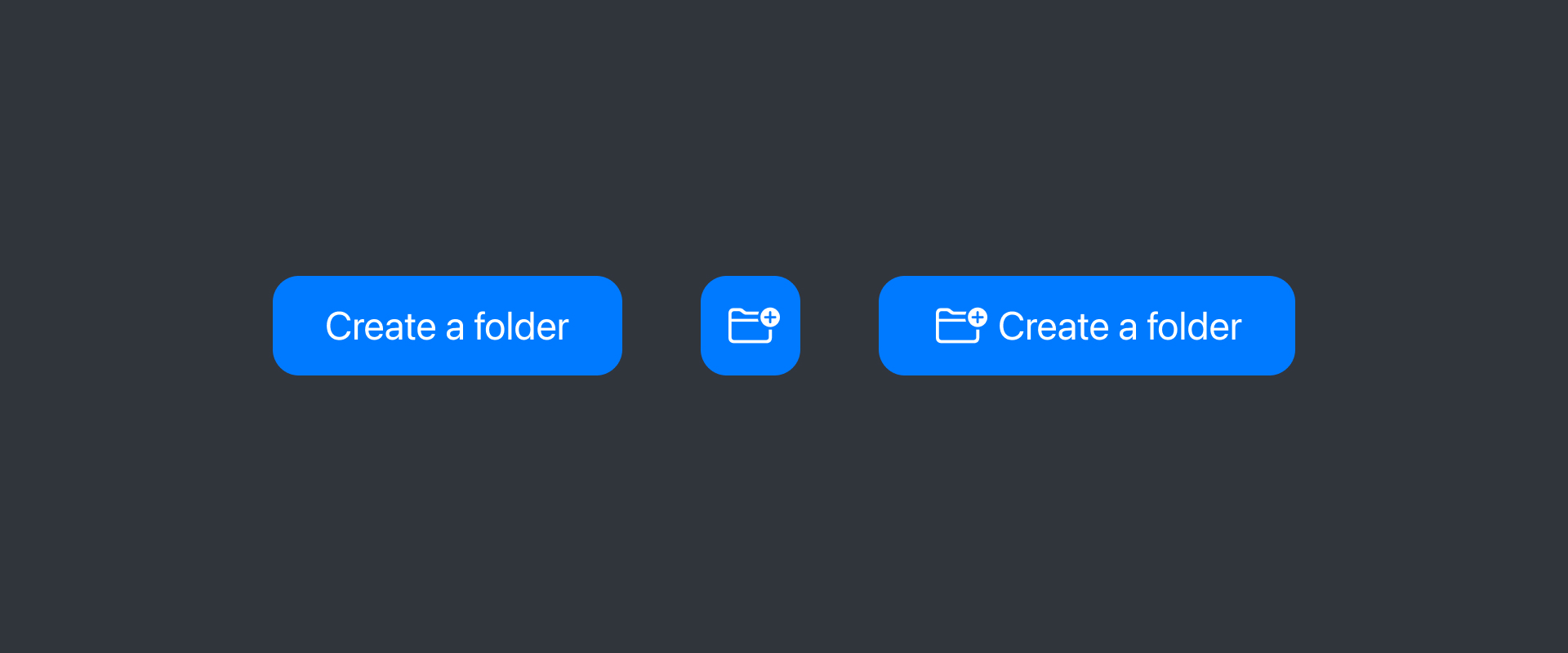
At the discretion of the designer, an icon may accompany the text in order to enhance the instantaneous understanding of the action. It is usually selected based on common past user experience.
For example, in the context of adding or creating a new element, a plus (+) will be used or, when searching for information, a magnifying glass will indicate the search action.
In other cases, a button may be left without text but still have an icon. The understanding of the expected action depends greatly on the established context. However, if it is not comprehensive, the action will be misinterpreted and the user will be frustrated or the button will be ignored.
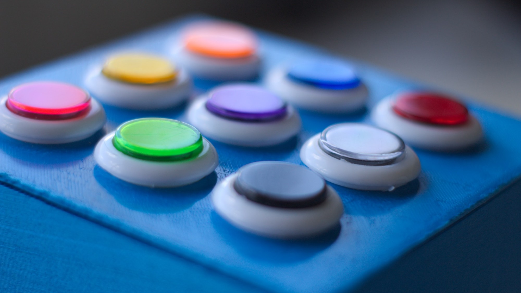
Color
Last ingredient before moving on to the preparation, the accent color. It is usually well defined to differentiate it from the regular content. In some cases, it is the same color as the brand.
Of course, the context can influence the color of the button. It is not uncommon to find a red button during a delete action.
How to successfully prepare your buttons
When designing an interface, it is not trivial to find buttons with different sizes or styles. This allows you to prioritize the pages and thus highlight the actions expected from the user.
Sizes
Whether it's for web or mobile products, the buttons have different sizes in order to give rhythm and hierarchy to the interfaces.
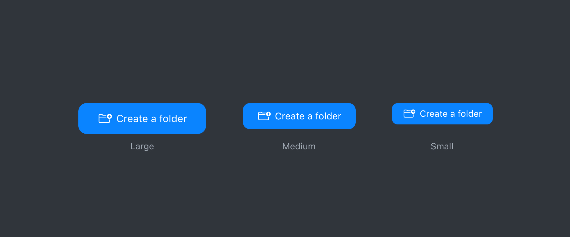
For those intended for the web, the WCAG (Web Content Accessibility Guidelines) recommends a clickable zone of at least 44 x 44 pixels. This is due to the increasing use of websites on smartphones, so these dimensions would correspond to the average size of a finger and not the cursor. This does not mean that your components will have to be at least 44 pixels high, but the interactive area containing your button would ideally follow their recommendation. Visually, the buttons can be any height you want! On this, regular heights are between 24 and 56 pixels.
In mobile apps, there is a slight difference between Google and Apple's recommendations. On iOS, buttons are typically 28, 34 and 50 pixels high with a touch area of at least 44 by 44 pixels. On Android, we will find instead heights like 32, 40 and 48 pixels with a touch area of at least 48 by 48 pixels.
| Device | Target size | Common sizes |
|---|---|---|
| iOS + iPadOS | 44 x 44 | 28, 34 et 50 |
| MacOS | 44 x 44 | 22, 28 et 34 |
| visionOS | 60 x 60 | 32, 44 et 52 |
| Android (Material) | 48 x 48 | 32, 40 et 48 |
| Windows | 44 x 44 | 24, 32 et 40 |
| Web | 44 x 44 | Entre 24 et 56 |
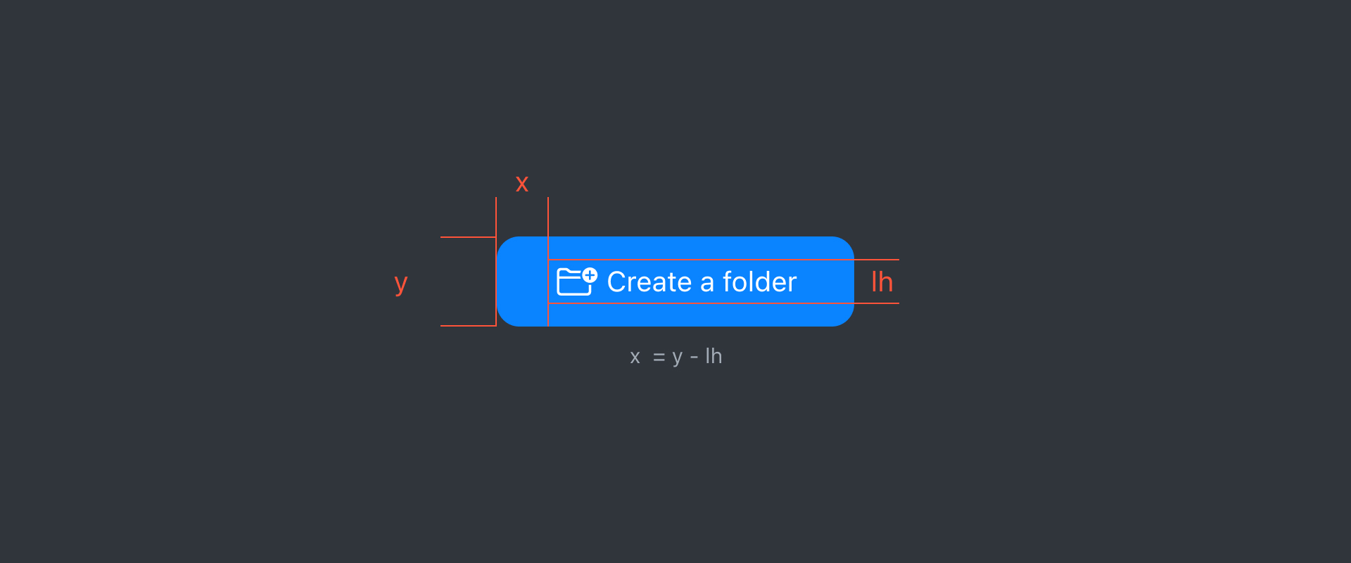
The size of the text also goes hand in hand with the height, as do the internal horizontal margins, a visual balance must be present. A common formula applies: a horizontal internal margin (x) equal to the button height (y) minus the text line height (lh), or:( x = y - lh). For example, if your button is 52 pixels high with a text line height of 20 pixels, applying this formula will result in a 32 pixel internal horizontal margin.
Of course, this is not a strict rule, but rather a basic one. In fact, when an icon is placed in the button, we often notice that the internal margins are differentiated in order to preserve the visual balance of the component.
Styles
Depending on the context, each action will not have the same importance. Using a simple variety of buttons with different styles means prioritizing actions while helping the user navigate. These variants are generally available with the following characteristics:
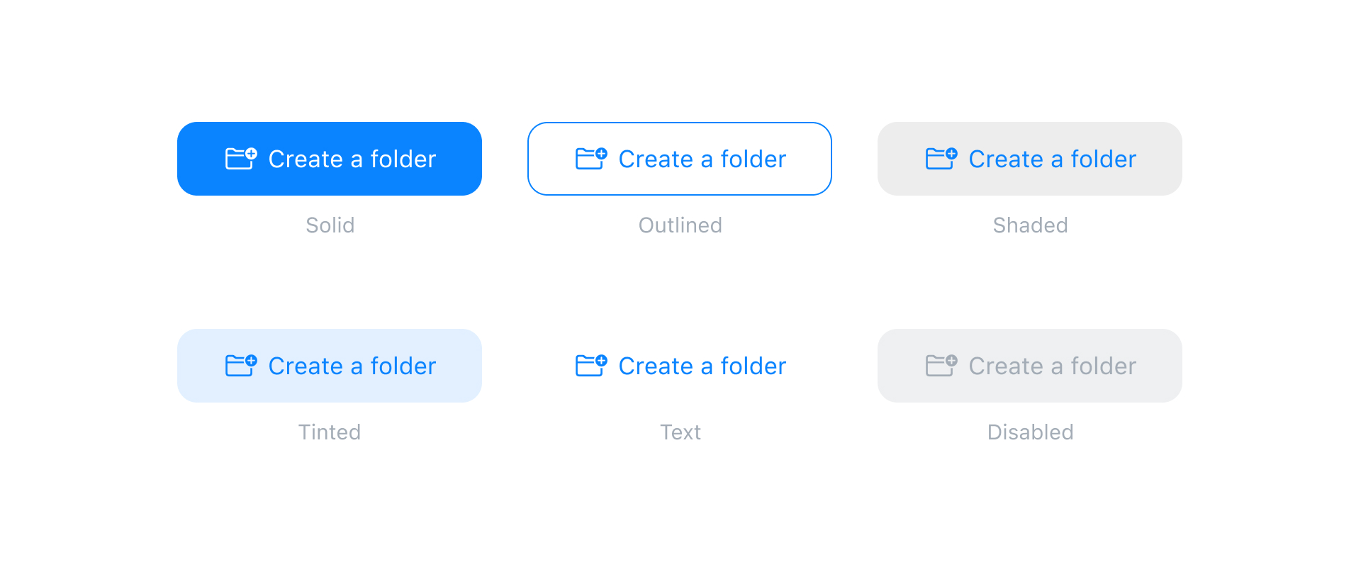
- Solid or Filled, the most recognizable style, the button will usually have the accent color in the background and will have text with a high contrast color. This variant is usually the main button that calls the user to action.
- Outlined, which has a more or less thin border, this border and the text will be in the same accent color.
- Shaded, more and more used, these buttons are characterized by a neutral background slightly more contrasted than the background of the interface and a text taking back the accent color.
- Tinted or Tonal, similar to the "shaded" button in its conceptualization, the background is however colored in a lighter shade and less saturated than the accent color of the text.
- Text or Plain, these buttons are quite common and have the particularity of having only text. For example, these may be the buttons for the website menu.
- Disabled, more than a different style, it is also a status that indicates that the button is not clickable for the moment.
Behaviors
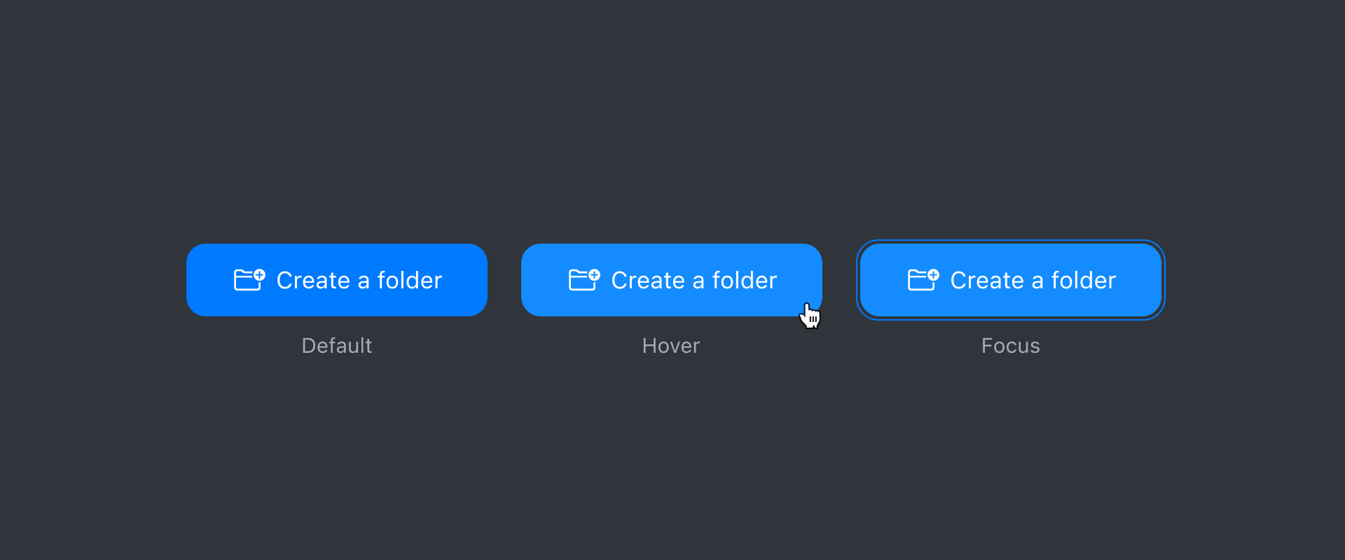
A button is an interactive element, at the same time, it is its primary purpose. It will thus present itself in different states such as when it is hovered over, when it is clicked or when it is highlighted. These variations must be thought out so as not to mislead the user.
Sometimes a button can include a group of actions. Usually, it will be identified by a chevron next to a meaningful indication like "More actions" which will open a drop-down menu.
Your button is ready, all that's left is to serve it!
In the context of a series of expected actions, the main button will need to be visible and will be positioned in the visible areas of the interface so that the user can quickly find it. Even when it is a so-called "neutral" or "alternative" action, the position of the button should be just as visible, but with a style that differentiates it from the main one. Less important or critical actions can be hidden so as not to interfere with the normal flow of the user.
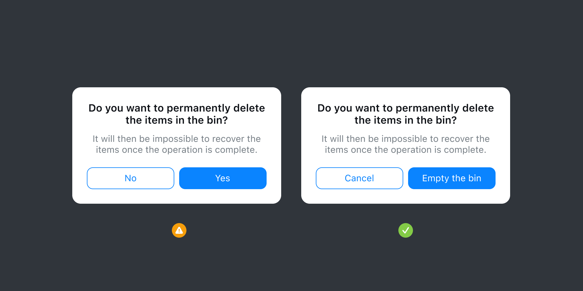
The text will always be written according to the context. For example, when the user is faced with a critical choice such as a delete action, the words selected should match the request. And, in order to make the user aware of the action he is about to choose, we will avoid leaving him with a choice such as "Yes" or "No".
If the button has no text, it will be entirely context dependent. A good example, the button to take a picture on your smartphone has no text or icon. However, thanks to the context, it is clear that it will take a picture!
In conclusion
Buttons are influenced by context and they are designed to respond to different situations, that's a fact. Badly placed, they will lose the user.
Ask yourself what you expect the user to see (or not see) when they take an action, but also what the user naturally expects at that moment. As long as buttons are instantly recognizable with clear actions, an app will tend to feel intuitive and structured.