Figma project structuring: How to stay in control of your design files
In this article, discover how to optimize collaboration between design and development teams by effectively organizing your files in Figma. Practical tips are shared for naming and structuring files, pages and layers, as well as creating durable interface elements, to improve consistency, continuity and productivity in your projects.

The way files are structured and presented can improve - or penalize, if you don't give it much thought - the ability of design and development teams to stay on the same wavelength, especially when it comes to tracking down the latest version! Of course, there's no single way of organizing files, and this will depend very much on internal organization. It's up to each team to find its own habits, but the most important thing is to maintain maximum homogeneity and continuity among all your files.
However, it can sometimes be complicated to know where to start. In this article, I share a few tips and our approaches to getting started with organizing projects and files in Figma.
Workspaces, teams and projects
Figma lets you organize projects by workspaces and teams. Workspaces are mainly used to differentiate branches or departments. Teams can be used to separate designers in various ways, such as by customer, product or field.
At Atipik, a single design team works on all projects. As a result, each client is assigned a project folder in which to store the various design files and interface guidelines. Most of the tips shared will therefore be perfectly suited to users with the basic package, and some from the professional package upwards.
Files in Figma
Naming files in a consistent way
The name of a file must be easy to read, scannable in the blink of an eye, especially when you find yourself working on several products for the same customer.
The following examples [Splash] Backoffice - Web --2023 and [Splash] Tokens - iOS clearly identify the product, product type, platform and revision of the file.
Separate tokens and styles from design files
In order to establish clear, cross-cutting rules between different projects, I separate all tokens (variants) and styles from the design file. Also, in the case of a new revision of a file, this allows these rules to be preserved while having a new, distraction-free workspace.
Create a file-specific cover image
In addition to having a small, clean and clear preview image on the overall file view, creating a cover image allows you to include additional information about your files, such as date of last update, target platform, project status or customer information.
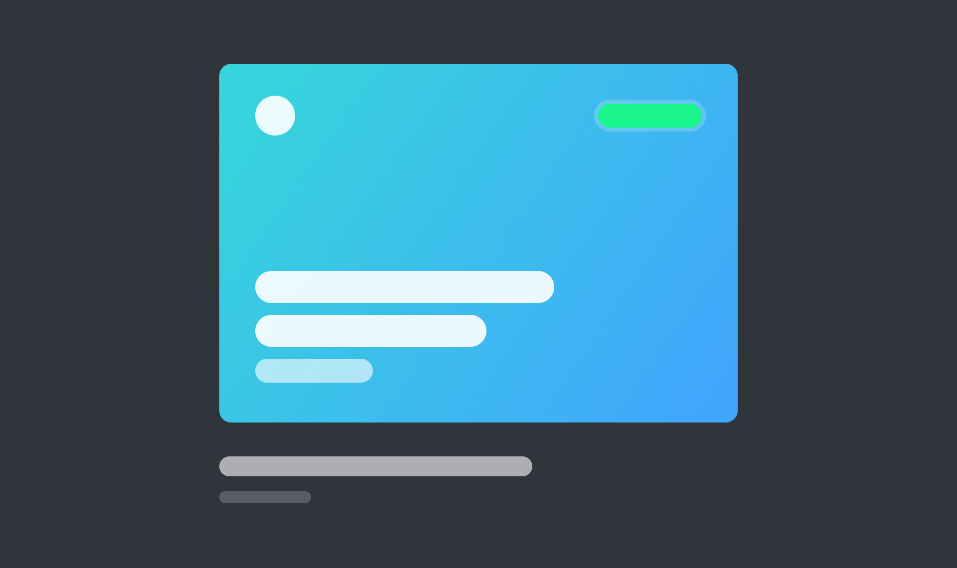
If time is short, there are plug-ins that generate ready-made templates, such as "Better Files Thumbnails" or "Thumbnail Kit".
Pages in Figma
Organizing pages (for better sorting!)
As soon as I create a file for any project in Figma, I prepare a series of pages to house the various components, icons or conceptualized screens. I add a few separators to make it clearer when there are a lot of pages.
.jpg)
Emojis help you find your way around quickly and give you an extra indication of the page's content, as well as adding a touch of color!
Differentiate development screens from drafts
The title of this tip speaks for itself: differentiating development screens from drafts may seem obvious, but it's important to emphasize it! Include a "Playground" page where you can let your imagination run wild, as well as a page dedicated to your final designs. This allows developers to immediately understand where they need to look for the latest versions, a genuine time and communication saver.
Screens in Figma
Naming screens with indications
The name of a screen can contain much more than its title. This field can be used to add information about a sub-section or the status of a screen. For example, home --scrolled indicates that we're talking about the home screen, but that it has the --scrolled status.
Group screens by flow and functionality
Group screens according to logical user and functional flows, and delimit these groups with clear titles and separating elements. In the latter, this is also an opportunity to indicate the user story of the screens, so as to check that the entire flow is correctly filled in. This will be a great help to developers or during presentations to customers!
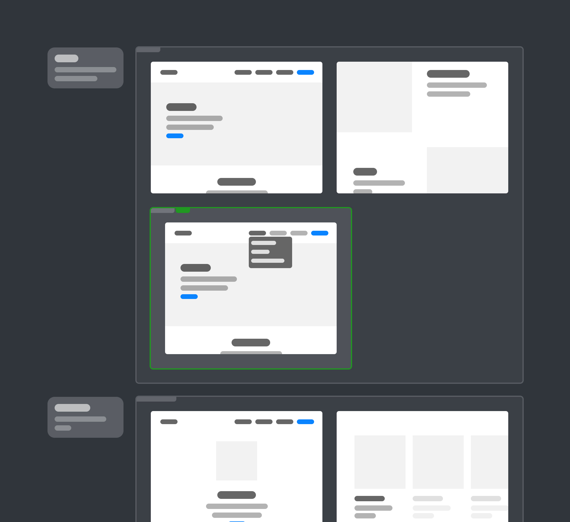
With Figma, it's now possible to create sections to properly separate the various screens making the task even easier! It's also possible to attach a "Ready for Development" badge to simply indicate to developers that the screens are ready for integration. This last feature makes it easier for designers to adopt good Design Ops practices.
Aligning views for developers
Grouping screens by themselves is not enough, as developers have little time to find groups throughout the design. Aligning views makes it easier to get lost, and helps structure the file for production.
Interface elements (Components) in Figma
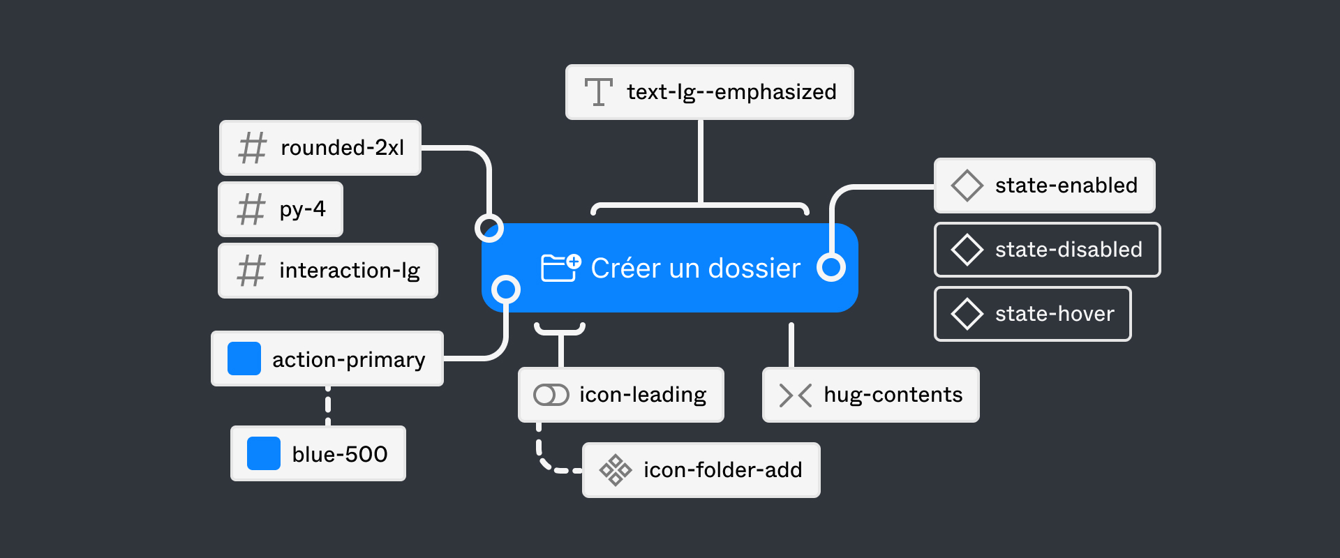
Naming layers
Naming layers isn't always a pleasant part of the creative process. However, this good habit serves several purposes:
- Group components together;
- Check the contents of components to clean up any hidden layers;
- Have a coherent discourse when mock-ups are presented or during internal discussions;
- Help developers design components;
- Make it easier to find one's way around when reworking the design.
Figma shortcuts: after selecting several layers, I use the key combination CMD + P (on macOS, and CTRL + P on Windows) to open the quick actions, then search for "Rename selection" to be able to edit everything at once.
Preparing "sustainable" UI elements
Designing sustainable UI elements involves a number of steps, grouping together the various options Figma offers.
- Using auto-layouts saves a considerable amount of time when designing interfaces. This habit allows your screens and interface elements to adapt easily to deeper changes that may not be immediately obvious.
- Creating variants allows you to structure the different states and behaviors of an element. A real guide for developers.
- Using tokens (variables) and styles allows you to establish rules that provide a solid foundation for all the most important elements... so you can break them and create around them!
All these steps allow us to be as close as possible to the way developers prepare components, to guarantee more faithful rendering of mock-ups.
Check elements with a checklist
Finally, establishing a checklist will increase the reliability of interface elements. It allows you to check every aspect, such as accessibility, connections and adaptability. At Atipik, this can be summed up in a few points:
- Accessibility of colors, components and contrasts
- Interactive states and animations
- Element properties and links to tokens (variables)
- Screen and language adaptations
While approaches to organization may vary according to the specific needs of each team, some practices are universally useful. These include naming files, pages and layers intelligently, preparing durable interface elements and taking care with the presentation of projects and files. Good habits ensure harmonious collaboration within teams to create more coherent and effective designs for projects.