Why is (almost) everything round in UI Design ?
Objects with rounded corners can be found everywhere. You can even find them in websites or mobile apps! Apple has always more or less used this style on mobile and then applied it to the web, while Google democratizes it even more with the latest version of Material. Behind these seemingly trendy choices, there is much more meaning than one might think.
Are rounded corners really magic?
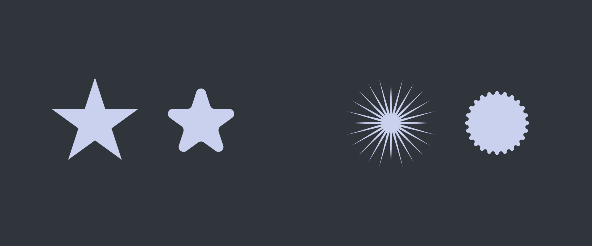
It looks more beautiful, softer, friendlier... It's normal, the human brain is conditioned to perceive rounded shapes in this way. At first glance, a slightly rounded object or interface element is immediately more attractive than right angles. This reaction was recently studied. When participants were presented with shapes that had sharp edges and others that were rounded, most of the people surveyed associated the rounded shapes as harmless, in contrast to those with sharp corners. And this behavior can be found in everyday life! For example: would you let a child play next to a cactus? Rather worrying if the situation arose, don't you think?
But also, the protrusion of angles can give the sensation of glittering: the tighter the angle, the less pleasant the shape is to look at. This sensation is strongly observable on the projections of star shapes, but not only! If you look at a black rectangle, you may have the feeling that the corners are brighter than the center.
Grids
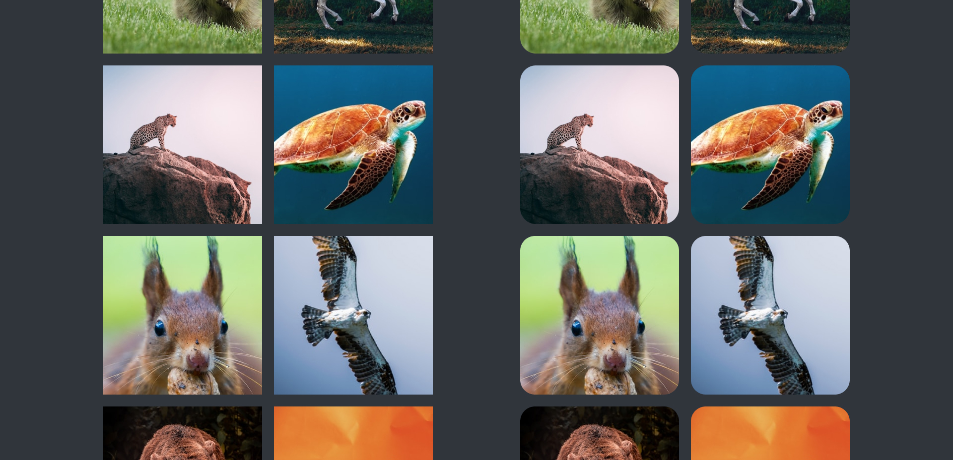
Rounded edges play a very interesting role in the perception of a grid. Our brain interprets grids with elements that have square corners as dense, while those with rounded corners as lighter, so the reading is more fluid.
Diagram
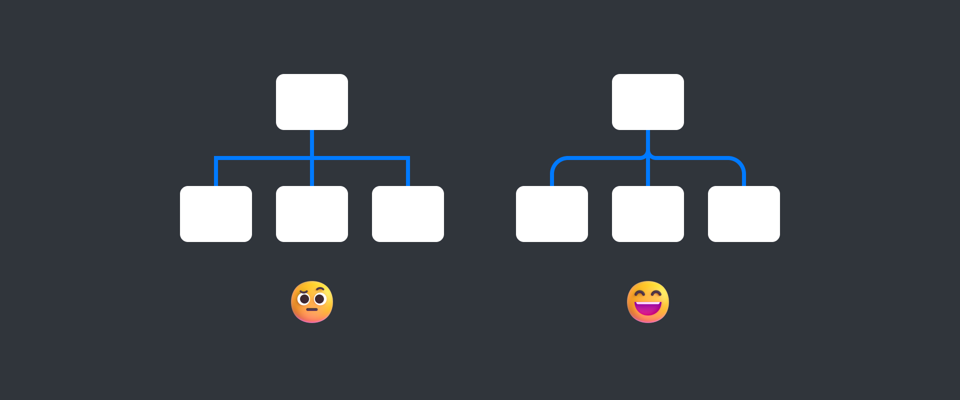
In a diagram, rounding off changes of direction makes the diagram easier to read.
Content
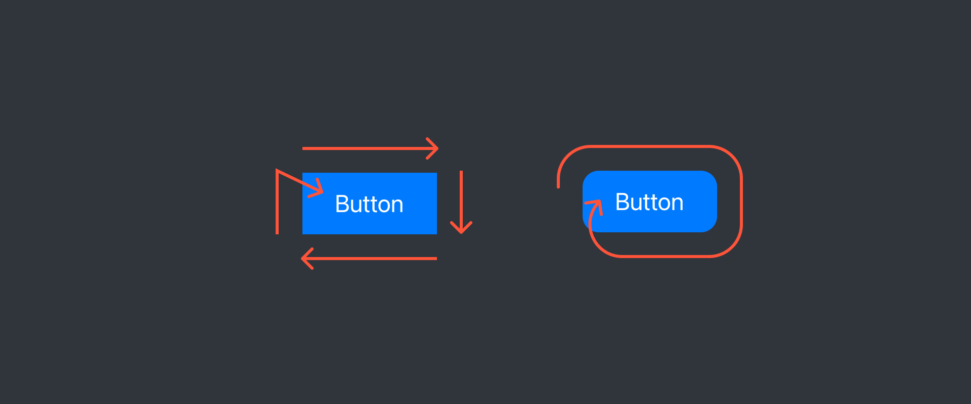
Naturally, the eyes will follow the curve of a rounded element to focus on the center, the content inside will stand out much better. A fully rounded shape will stand out and is ideal for indicating priority actions to the user.
Highlight
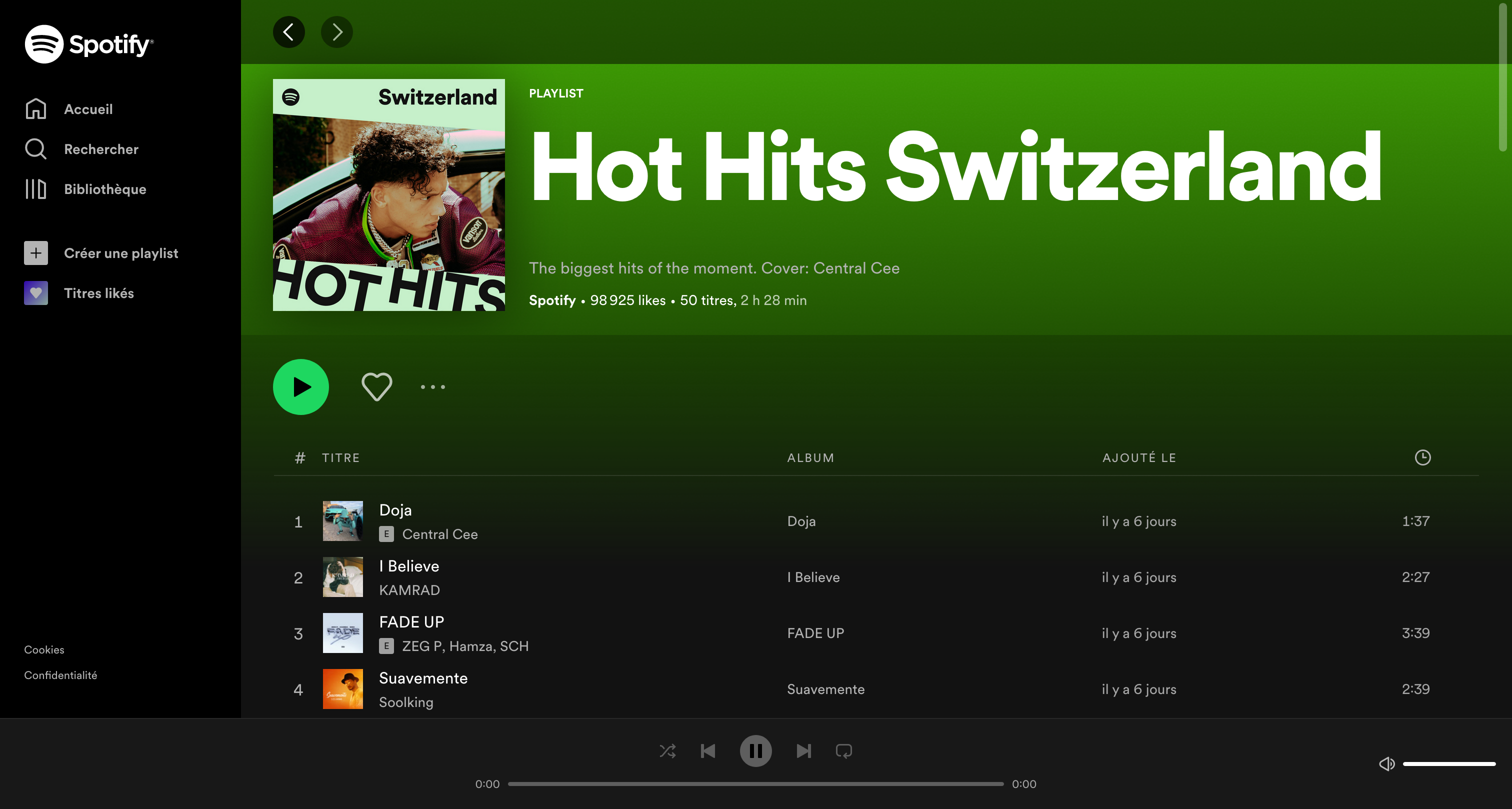
A fully rounded button will be interpreted faster than other elements in the interface. Therefore, it will be seen first. As a good example, Spotify: the main actions like playing music are rounded.
The limits of rounded corners
Of course, rounded corners are not the answer to all interface problems. They have their flaws that should not be overlooked when designing interfaces for the web, tablet or mobile.
Highlight (second round)
Generally speaking, too many actions with similar levels of importance will lose your user. With rounded buttons, it's worse. The eyes will constantly look for the simplest shape, the user's eyes will be as if magnetized by these perfectly curved elements. Moreover, they can easily be confused with other interface elements like badges or filters.
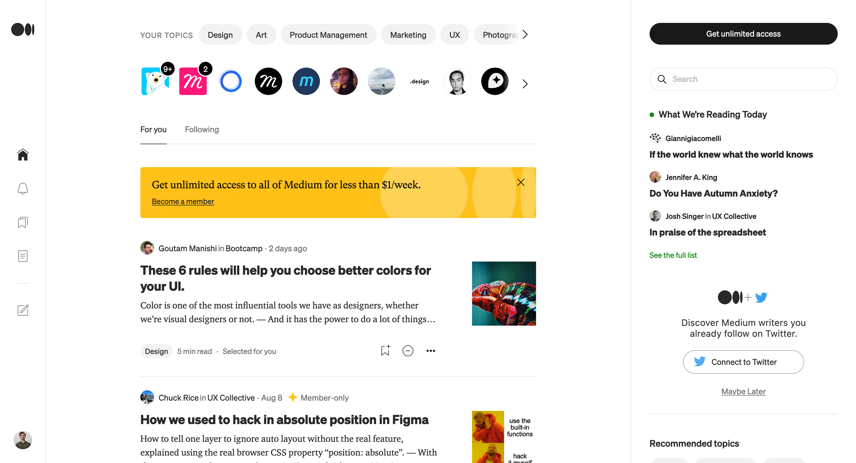
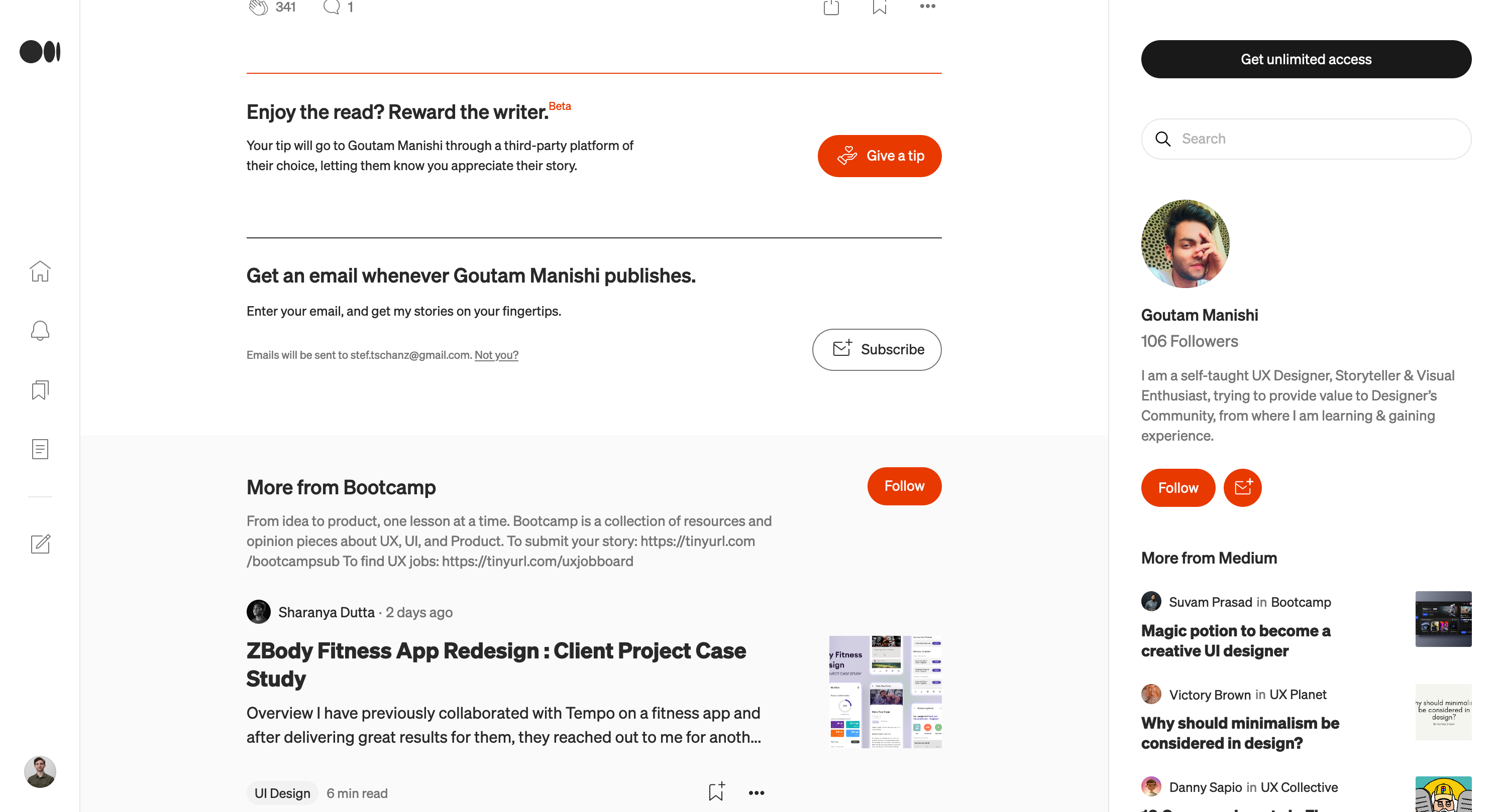
In the screenshots of the website Medium, the strong use of this style for the buttons easily distracts the eye towards them while the text remains an important element for a blog. Even if it is a conscious choice, it is a shame to use this kind of stratagem at the expense of the user's comfort.
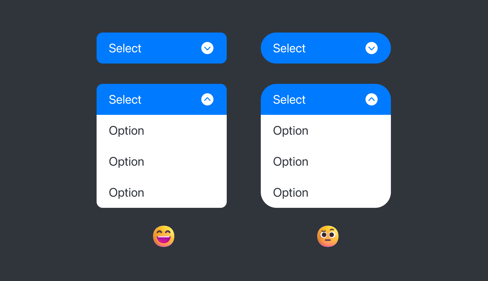
Selector
A nested component with too rounded edges will be less visually optimal than one that is slightly rounded due to the fact that the overall shape is imperfect. It is possible to correct these defects, but you would lose space.
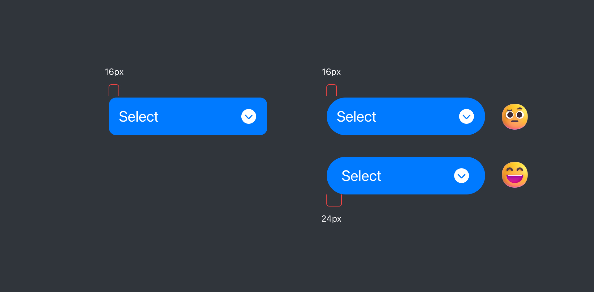
Internal Margins
Depending on the rounding of an element, the internal margins will need to be adjusted to balance the whole. Depending on the design guidelines, this adjustment may compromise alignments with other components. According to the visual balancing guidelines, the more rounded the component, the less content there may be in the component.
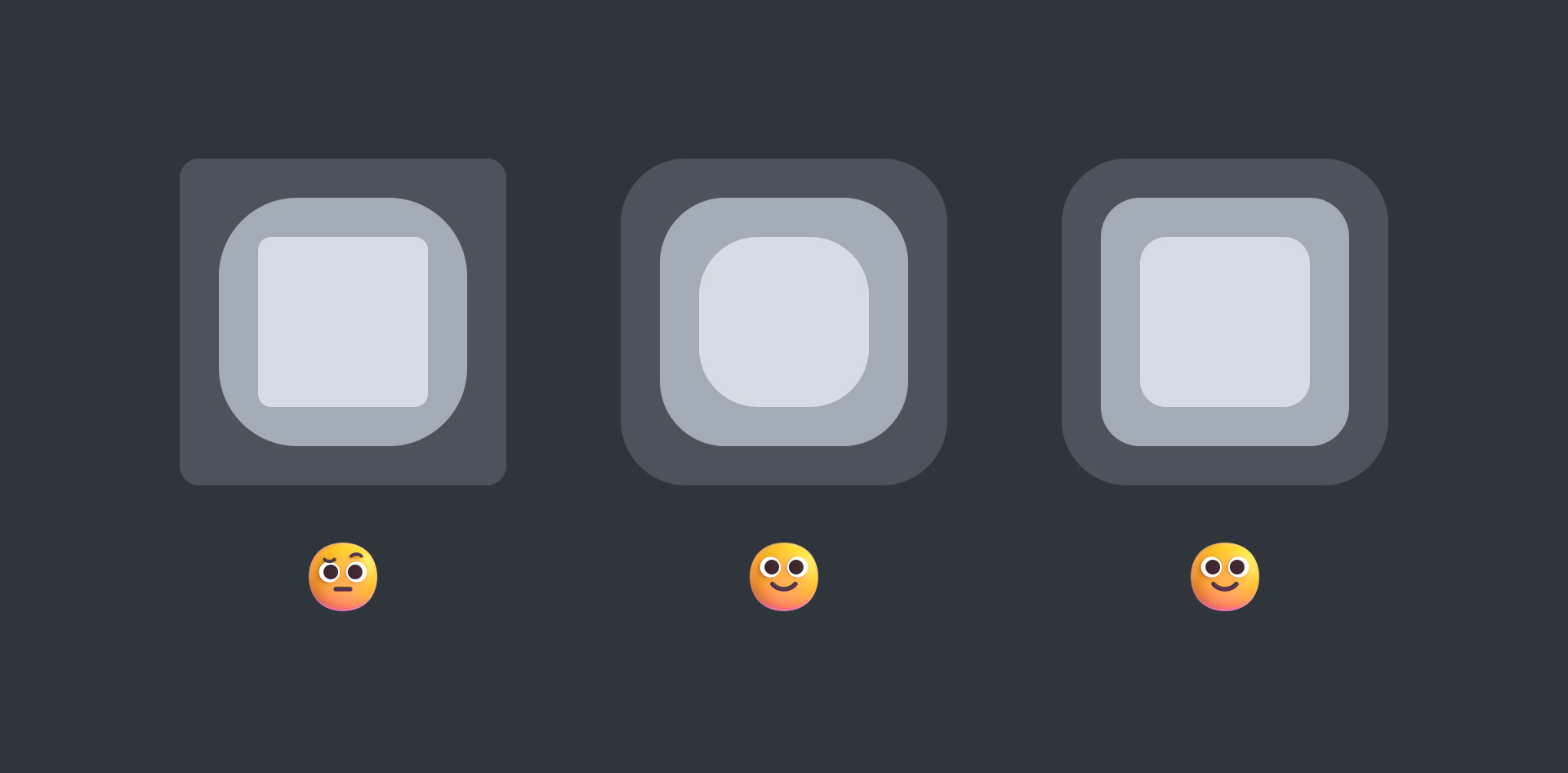
Interlocking
Another point to watch out for is that when several components are overlapping, the rounding will have to respond to each other. Generally, the more nested a component is, the less pronounced the rounding will be, or it will be similar, but with balanced margins.
Conclusion
Finally, the use of rounded corners in the design of interfaces can be less risky than it seems, as long as you are aware of their effects on users and are consistent with the design guidelines.