Why user/customer experience is the new brand identity
If you pay close attention to posters, products and other visual information on a daily basis, you will notice that the identity of different brands is similar. Thus, several sectors align themselves, sometimes without being aware of it, on the same design trends to form codes, or rather I would call them guidelines. This phenomenon is called "blending". But then, how do these brands have such different identities without actually being different?
The blending phenomenon that has become the norm
Blending is the complete opposite of standing out, it is about blending easily into a specific sector in order to stick as close as possible to the competition.
Behind this strategy, customers are better integrated thanks to familiar and intuitive visual cues. The transition from one brand to another is thus more delicate. For example, an identity that resembles that of a major brand, with a few adjustments, will be better perceived by the new clientele than something entirely different... and this is even more obvious in interface design. For this topic, it's mostly called standardization of interface.
.jpg)
Standardization
Printing, radio, television or car dashboards have gone through standardization. It is a kind of community consensus to agree on practices that seem to suit the majority, or even all. Most of the time, this agreement focuses on the practicality of the object or interface.
If people don't know how to use your design, they will feel bad about it. They will feel stupid. - Donald Norman
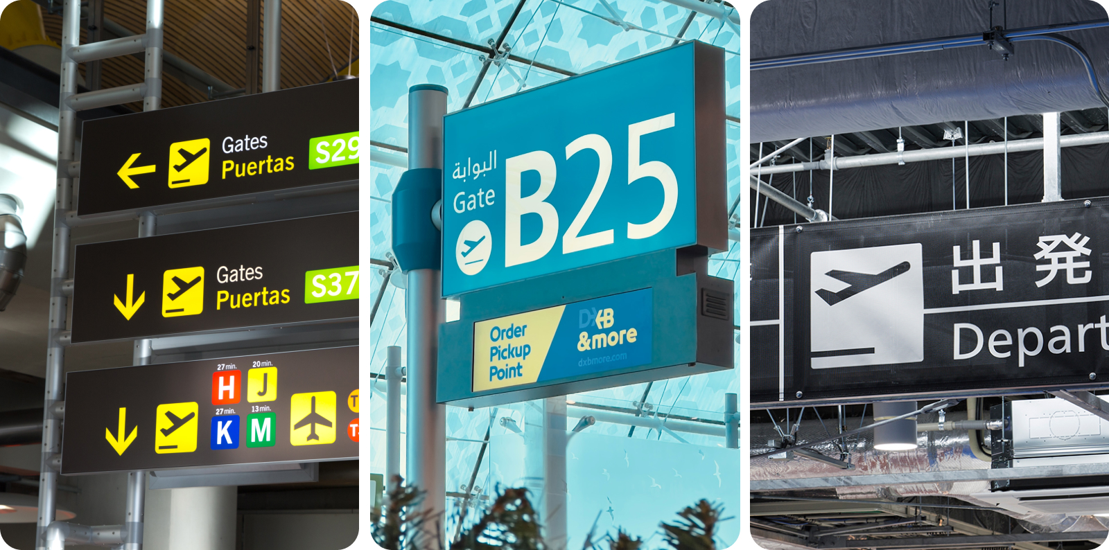
It is nevertheless pleasant to find the same indications in all the airports of the world to find your way. Or when you want to eat a good Italian pizza to quickly identify an Italian pizzeria or even that a baguette looks like a baguette! Thus, standardization is not always a bad thing. If you understand it well, you can even add an overlay to give it a slight unique look.
This applies entirely in the area of interfaces. In a mobile app, it's more pleasant for the user to find the main navigation at the bottom, that the icons are quickly identifiable or that the purchase process is similar to others.
Being different without being too different, quite a story
Despite all this similarity, we can clearly identify one car from another, one baguette from another or one app from another. Why is this?
Originally, caves and objects were marked with paint to indicate their belonging, and then, as early as ancient Egypt, symbols were used to sign commercial products such as pottery, stone blocks, etc. The signature by name remained very elitist, it was very much used by the Romans and the Greeks. Thus the symbols used with as main functions: ownership and provenance. These began to be too close to each other until they reached a certain limit.
From the industrial era came the conception of companies involving the mechanization of marking through a symbol and the name of the company. As time went by, it was understood that a certain importance emerged from these markings. Companies have invested immense means to develop them by stylizing the typography, adding shapes and colors. The brand identity as we know it was born.
Unfortunately, another limit appeared at the same time as globalization, which brought brands closer together around the same ideas, differentiating by the logo was no longer enough. A solution had to be found, so messages in the form of "slogans" or images were added to help customers better identify with a product than with another. These messages opened a new chapter in the expression of brands with their own style, for example, by using humor or drama in advertisements. Very quickly insufficient. However, if the identity goes totally outside the assigned sector, it will be misunderstood.
.jpg)
Today, brand identities are developed through the values for which customers are attracted to them. They communicate on these values mainly through narrative means such as photography, video or textual publications. These stories touch people closely through the emergence of strong emotions. However, thanks to or because of a wider access to information, less and less people believe in these stories and with social networks they are drowned in the mass. What to do?
Providing experiences
Informing about the benefits of a product is no longer enough to convince customers. Customers must try or see for themselves. We are talking about creating new behaviors for brands. For this, it is necessary to understand the users, almost to be one of them first. What makes me use these shoes, or this car, or this app and not another? We no longer buy a product, but we use it, we do or will do something with it, we live an experience with it, whether it is physical or digital.
For digital products, the comfort of use is an important part of the design. Designers will therefore try to offer a new, intuitive and fluid experience, while respecting current standards and trends. An app that is used more than another often responds to a particular experience sought by the user. It can be a particular functionality or an intuitive flow that fits easily in the daily life.
At one time, when I was still organizing my days, I used the Habitica task planner. It has the particularity to gamify your days by turning tasks into quests where you earn experience points or equipment for your character. This app is not necessarily the easiest to get used to and is a bit old-fashioned on some points, but it provides me with a pleasant and fun daily experience. Thus, I have a great memory of it!
A well-balanced balance
Paradoxically, the visual identity remains a strong component of a brand, it is even a base, whether it is local, regional or global. It identifies the sector to which the entity belongs. Imagine an Italian restaurant that uses the codes of a Japanese restaurant? How will we know that we are eating Italian?
In the case of web or mobile interfaces, being within the standards is a sufficient guarantee of usability, but you must not forget to add your own customizations such as, for example, icons, colors or typography, and above all your own little touch of user experience that will make you stand out.